At last month’s TELE workshop in South Carolina, representatives of the Indian Creek Woodland Savanna Restoration Initiative presented a flyer for their upcoming event. The Initiative, a collaboration of federal, state, and private partners, seeks to improve forest health, water quality, and wildlife habitat as well as reduce wildfire risk on national forest land and nearby private lands. To achieve these goals, the partners are hosting a workshop for landowners later this month about ways to improve the beauty, health, and value of their woods. At the TELE workshop, the flyer for the event underwent key changes to make it more appealing to the target audience: Woodland Retreat landowners. We’ve highlighted the changes by numbering them on each flyer:
Before:
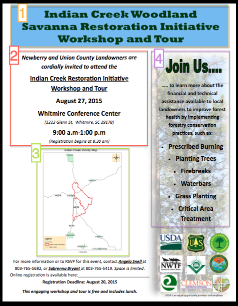
1. Title: This title is very long and technical. The average landowner won’t be moved to action by reading the name of the project. In reality, most landowners won’t know what the partnership is. The title may make the reader more confused than curious.
2. Text: The text here is fine, but there are no images to draw your eye to this spot on the flyer.
3. Map: This map is good for orienting the reader, but it does little to connect the reader with the natural landscape. For those landowners who care about a particular river or forest, they may be left wondering whether the project will take place there.
4. Sidebar: The language here is very technical. While some landowners may be moved to attend by the prospect of improving their forest’s health, most Woodland Retreat landowners care instead about the amenities that a healthy forest can bring. The conservation practices listed are also very technical; landowners may be confused by terms like waterbar or critical treatment area and think that those practices will be too hard to implement.
After:
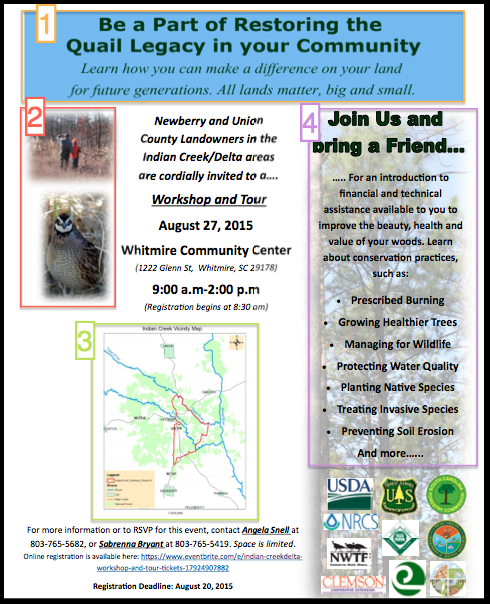
1. Title: This title appeals to the Woodland Retreat landowner’s sense of community. It uses the quail as a hook to engage the reader and the subtitle to play on the reader’s emotions. It is behavior-focused and immediately tells the reader that they could benefit by attending this workshop.
2. Images: These pictures make the flyer’s overall look more appealing and draw the reader’s attention to the details of the workshop.
3. Map: This map puts the natural features of the community into context. The additions of the rivers and forests also make the map more colorful and interesting without making it overbearing.
4. Sidebar: This language is much more understandable and, rather than focusing on the conservation practices themselves, focuses on what benefits the landowner could achieve by learning how to undertake conservation practices. Many Woodland Retreat landowners may identify with one or more of these benefits as something they are concerned about on their land.